Version 0.17.0
Posted February 6, 2021 ‐ 4 min read
Big feature update + rebranding"
The big update
I’m really excited to launch this update, there’s some good stuff in here.
New name and branding
First, JotDown has been renamed to Deepdwn. There are a couple of reasons for this, but mostly it should be much easier to find by name. (Project downloads may still be called JotDown.zip for a bit)
The Itch.io page has been updated with a spiffy new design to help highlight features, and the app has a new icon. I’d love feedback on the page as well. If you have questions about Deepdwn that aren’t answered on the page, or if anything’s confusing, please let me know.
Here are the new features!
Preferences
Having all of the app settings in the main menu was getting ungainly, since there was no way to provide help text or descriptions for them.
Deepdwn now has a preferences panel, accessible from the gear icon in the lower left corner of the app. The original menu is still available by pressing Alt (Mac folks' menus are always visible so this part doesn’t apply).

Also there are now tooltips for some items!
Toolbar
Several actions now have dedicated buttons in a new toolbar at the top of the application.
From left to right here, those are Help (creates a new markdown example document), distraction-free mode, fullscreen, and show preview window.
Mixed monospace and variable-width font handling
While Deepdwn was designed for monospace fonts (where every character is the same width), variable width fonts can be more comfortable for reading and writing, especially for long, text heavy documents, so serif and sans-serif variable width fonts have been added!
However, for markdown, monospace fonts are pretty important, since much of the formatting is controlled by indentation.
To that end, Deepdwn handles these fonts via a new “mixed monospace” mode. Where it’s important, Deepdwn will automatically use the original monospace font to preserve alignment and indentation, and switch back.
You can find this setting in the new preferences panel.
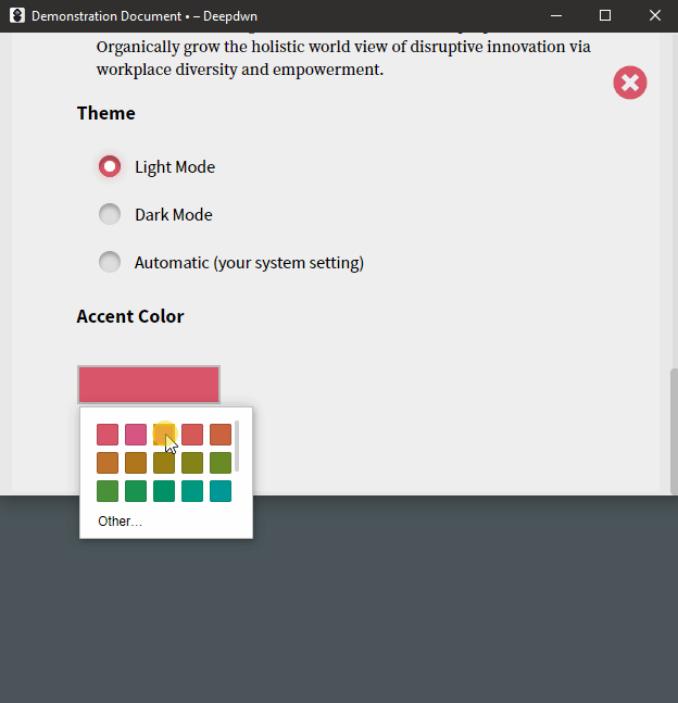
Automatic dark mode
When enabled, Deepdown will switch to dark and light mode based on your system’s setting. This is most useful if your system is set up to change between dark and light modes on a schedule. This is enabled by default for new installs, but you can select either dark or light mode (in app preferences) if you prefer.
Application accent color
In addition to dark and light modes, you can now select the primary, app-wide accent color. Select one of the defaults, or choose an exact color to use.
Drafts everywhere
Drafts (new, unsaved files) are now now shown alongside other files in the file list (and sorted to the top), instead of only living in their own separate Drafts filter. This makes a big different for ‘getting lost’ in the application, since creating a new file selected this filter by default, hiding non-drafts.
Tweaks
- Tag, category and headings have animations in some cases now (usually when they’re being reordered).
- Distraction-free mode now has a persistent button for exiting the mode (in addition to the keyboard shortcut, and spamming the escape key).
- In distraction-free mode, the outline mode panel has a visible (and better aligned) resizing handle
- The window now appears earlier in the startup process
- Better performance when dealing with very long documents
- When creating a new draft, if the new file would not be visible because of search or current, selected filters, those will be cleared so that it’s clear a file has been added.
- Smooth transition in the outline view when changing between documents
- Save as PDF feels more responsive: Save prompt appears immediately, instead of after PDF creation completed
- Outline view is more compact
- Tweaked display for find and replace items in editor
- Default to compact view in file list (applies to new users)
- Default application width is wider (applies to new users)
- Slightly more obvious highlight styles for filter and file lists
- File and filter list display is more consistent
- Better alignment and text truncation when resizable panels are very small
- File “unsaved” dot marker is bigger and more obvious
- Security and performance improvements
Bug fixes
- Double clicking panels to resize them makes way more sense, works better, and shouldn’t get weirdly stuck (especially when there wasn’t much free space available).
- When editing the document, the currently active heading in the outline view would become deselected
- Fix issue where only the editor area would shake when power mode was enabled
- Made exiting distraction-free mode (and preferences) via escape key more reliable
- When right clicking some UI elements, they now stay highlighted while the context menu is open
Next update
The next features I’m working on focus on accessibility. I’m planning full keyboard navigation support in the app, and finer grained controls for power mode (instead of only on/off).
If you have suggestions on this topic, or other accessibility accessibility concerns, please let me know.